Showing posts with label Fabrics. Show all posts

Monday, September 16, 2013

Emerging Trend - Arrow Design

I love it when I begin to see a new trend.  This one is an "arrow" (also called "feather") design.  It's similar to a chevron pattern, but fresher.  I dare say more youthful and fun.  Have you noticed it as of late?
via

I started seeing all different versions of it popping up when sourcing fabrics back in the Spring.  Now, it's more than fabrics - I'm seeing wallpapers and even accessories like trays, jars and bathroom accessories.


I can see using this pattern just as you would a chevron either as the main accent fabric (if it has several colors in it) or as a secondary fabric (if it's a two color fabric like below). 


Just love this take on the trend - it feels tribal and modern all at the same time.

via

I will definitely be working this into a design plan soon.  Happy Monday! M.


Wednesday, September 11, 2013

Alessandra Branca for Schumacher

Back in January, I was interviewed by Birmingham Home and Garden as a Tastemaker for trends in 2013.  One of the trends I mentioned was the 1980's floral resurgence.  I also posted about it almost a year ago when I first began to notice the florals popping up - Trend Spotting 80's Floral

Fast forward nine months and this trend is in full swing - case in point, Alessandra Branca collection for Schumacher.  The colors are extraordinary in this collection.  The number of colors in the signature fabric is over the top.  Also, it very hard to tell from the images I snapped while at the design center, but the floral fabric below is a chintz!  Then the IKAT chevron is a polished cotton.  

While it does take some getting used to - deep breaths really.  When I look at the floral pattern on it own, I have flash backs of college and all the dorm rooms my freshmen year.

But, when it's paired with current wovens and fretwork patterns, it feels fresh to me.  Much more hip and chic than my college days.  

Also, in the more muted colorways like this citrine with blacks and deep greys, it feels much more current to me.  All these are part of the same collection.  I love that she's included lots of secondary patterns to soften the busy floral. 

So, what do you think?  Are you ready for a blast from the past?! M.


Monday, September 9, 2013

Hand Painted Velvet - Follow up

Do you remember this tease of a post I blogged about back in May?  See the entire post here.  If you recall, I showed you this picture in my post. . . .
 

I know, it was mean of me not to give you the details, but we had just started this project; and I really wanted to save the reveal once the installation was complete.  I had visited the studio of the very talented Kitty White, and had fallen in love with these hand painted strips of fabric.  We began to collaborate on this project, and came up with a wonderful hand dyed velvet trim to pick up the tone of the teal colored mohair host and hostess chairs.  Kitty then painted a metallic paint onto the fabric and re-dyed the velvet for a wore look.  The process was quite meticulous but the results were well worth it.

Here's the result . . . 

Kitty White is truly one of the most creative people I've ever met.  Not only is she a fabulous decorator and artist, she also designs some of the most stunning jewelry I've ever seen.  Her studio is in a carriage house behind her home and the entire space is totally enchanting.  If you are interested in something similar for your home, please contact her.  Just a visit to her studio will inspire you beyond words!    

When we started this project, the room was actually a formal living room.  My clients never really used the living room and were in need of some office/homework space on the main floor.  

Also, they did not want to permanently alter the floor plan of the house.  So, we decided to visually close the large opening between the formal dining room and living room by using the linen drapery panel.  Here's a close up of the tape.  Since our plan was to layer the artwork on top, I chose an inverted flat pleat on the tops of the drapery panels.  

Once the dining room was in it's new spot, we created the office space in the room beyond (which can now be accessed through the kitchen area).  As an aside, the doorway was not center on this wall, so we used the drapery panel to center the buffet on the accent wall.  

The result - a marvelous focal wall in the dining room.   As you can see, the oil painting over the buffet appears to be floating on top of the drapery panel.  I will be posting later on how we accomplished this. Since we had two story ceilings in this room, we had to be very clever on how we hung the painting. 

I promise to share the trick with you very soon!  Until then, I hope you have a marvelous start to your week! M.


Thursday, August 15, 2013

Width Decorative Tapes

Just pulled these fabulous new decorative tapes for a project I'm working on at the moment - at least two of them will be making their way into a design plan for one lucky client!   All those shown below are brand new for Fabricut.  Just loving the widths of them and the color options.  Very yummy! 

Here's a close up of the color detail in one example . . .

All are available through Mandi Smith T Interiors, and I'm happy to ship them any where in the U.S.   Feel free to contact me, if you're interested in pricing!  Enjoy your Thursday. M.  

Wednesday, May 1, 2013

Interesting Week

As we are quickly approaching the end of the school, I like to refer to this time of year as the second Christmas.  It really feels that busy to me every single year.  There are tons of parties and "wrap ups" for my kids that my head is spinning.  Not to mention all the client projects for families who want to get it done in time to enjoy their summer break.  I say all this to give you a heads up that the blog is going to be lean and mean for awhile.  I hope to be caught up and enjoy some quality time with my children as well as some time to post several topics that have been on mind.  

But for now, I'm going to give you a bit of a tease.  Yesterday, a client and I met with a very talented artist/interior designer who is going to be helping us with a very special project!  I can't wait to give you more details and share pictures of the finished space.  But for now, here's your tease! 

These are images from her studio . . . 


Any guesses what we're up to?  M.


Thursday, April 18, 2013

Take a Walk on the Wild Side

I found this fabric recently for a client to consider in reupholstering a pair of stunning chairs in her living room.  These beauties are worth reupholstering as the lines of them are unusual and really special.  Although these chairs are in a formal living room, she really wanted the room to feel more casual.  The solution - a Tussah silk.  

Tussah silk (also known as Shantung) is made from wild silk worms.  Unlike silk cultivated from worms in a controlled environment, wild worms eat a natural diet of oak and juniper leafs.  This diet gives the silk fibers variation in thickness and color. 

Also, in the wild, the moth actually hatches from the cocoon; thus interrupting or breaking the continual silk thread of the cocoon.  So, you get shorter threads which must be overlapped in the weaving process for even more texture.  The result is a fabulous, nubby fabric with all the sheen you would expect from silk.  It always amazes me that something so beautiful comes from the discarded cocoon of a worm! 

 Just look how lovely. 

The sheen lends to the formality while the rustic woven look feels casual.  Just wonderful. 

This gorgeous chair is upholstered in tussah silk. 

Here's a close up of the fabric . . . 
Just look at all the nubby goodness.  So, if you are looking for a formal fabric that will also dress down a space, consider wild silk.

Sometimes the most beautiful things can come from very unlikely sources.  Think about that as you go through your day! M.

Tuesday, February 26, 2013

Spring (please) - Bring It!

Happy soggy Tuesday.  Over the weekend we had one absolutely gorgeous day.  Finally, there was a break in the cycle of rainy days we've been having here in Birmingham, and our entire neighborhood seemed to be out and about, soaking in the sun.  I didn't realize how much the long succession of grey days had affected my mood.  When the sun came out, it instantly felt like Spring to me - only to be greeted with more rain.

 I think Spring happens like that - with little starts and stops - one minute you think it's here and the next you're bundled up in a wool sweater.  So, for me, I see this as hope that Spring is just around the corner.

Speaking of Spring, have you seen Schumacher's fresh new offerings?  This brand spankin' new collection for Schumacher was designed by the very talented Mary McDonald . . . 
It's total goodness.  The tapes are ultra wide with the most detailed embroidery, and I'm a total sucker for a fabulous flat tape.  If you've ever see Schumacher's fabrics in person, you know these images do not even come close to how these fabrics look in person.  There really is a reason they're more expensive. 
One thing in the collection really caught my eye.  The Appliqués.  These gorgeous "do dads" can be applied to pillows, upholstered pieces, drapery panels - even on linen wall coverings.  The only limit here is your imagination.  Just look how fabulous the addition of such a small detail takes this ordinary sofa to a whole new place!  I will be working this small detail into a design plan very soon!
Also, I adore the woven jacquards with just the slightest metallic sheen (paired here with a watery green velvet).  Love.  This is the fresh new version of IKAT. 
If you would like to see the entire collection - click here.  With all the pretty things to look forward to, I think I can handle the rain just a few more weeks! M.


Monday, September 17, 2012

Falling Into Fall - Part I

Since Fall is upon us, I thought it would fun to discuss a few ways you can give your home some seasonal accents without breaking the bank.  Today, I want to talk about the use of fabrics to accomplish this.  You don't have to reupholster a chair or sofa to get this look either.  The most affordable ways are through pillows, throws, slipcovers and even strips of fabric used in clever ways to give you a custom look.  

Often clients will tell me Fall colors don't go with the colors of their home.  So, their solution is to simply ignore the season and wait for Winter.  This is usually the case with cool tone interiors such as blues, grays, pinks, and lavenders.  There are ways to give these colors a Fall take.   But first lets look at the easier of the two - warm toned interiors.  The traditional colors of Fall - oranges, reds and yellows work great to give you the look if you already have a warm toned base in your space.

Warm Toned Interiors
Color blocking with orange and red velvet pillows does the trick.  Simple. Simple.  These pillows have turned this white beachy style into a cozy Fall retreat.  The rug helps too!
Architectural Digest


This works in bedrooms too.  By adding an orange blanket or duvet and just one fabulous pillow (I think this is Schumacher - Zanabar), you are there.

Look what a simple throw can do . . .  (add cut branches of leaves from the garden to a clear glass vase and you've repeated the color for amazing results).  I think it's interesting that once you added a color, any other items in the room that have that color starting speaking to it.  Did you notice the books on the console table that have orange/red yellow covers?  And the bits of rust in the painting?    

Again, color blocking with orange velvet pillows and a throw.

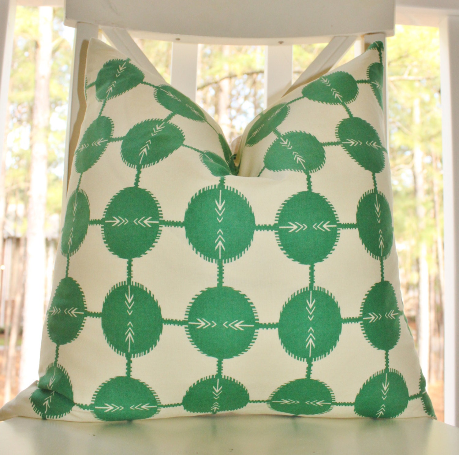
Cool Toned Interiors
OK, so easy peasy if you have warm tones.  But what about the cool tones.  If you have cool undertones like grays and blues, what do you do?  You go for browns and greens.  You will be amazed what this can do.

In this example, the striped pillow does the trick.  Honestly, I think it is styled for Spring since you have the yellow vases, but change these to more muted tones and you are there.
via 


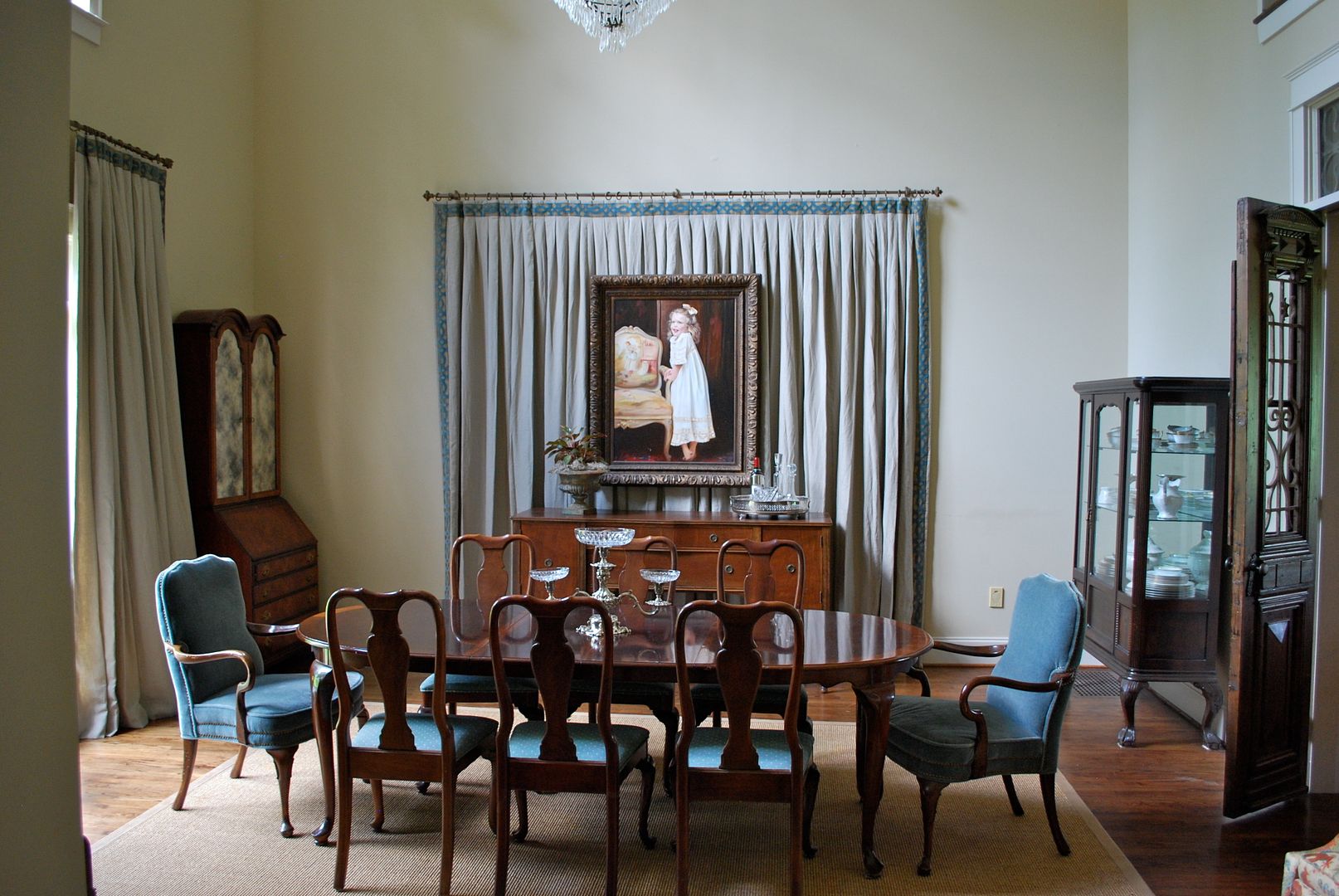
In addition to color, think patterns that speak to Fall - plaids, strips and even florals in the right tones all speak to Fall.  Also, don't forget texture - flannel, wool and cashmere.

In this image there is not a bit of orange/yellow/red.  But it still feels like Fall to me with the camel throw and plaid.  So cozy.
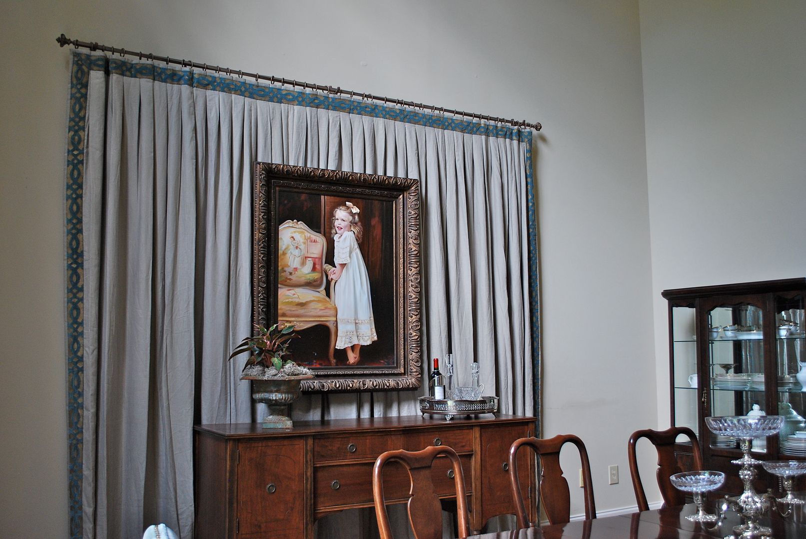
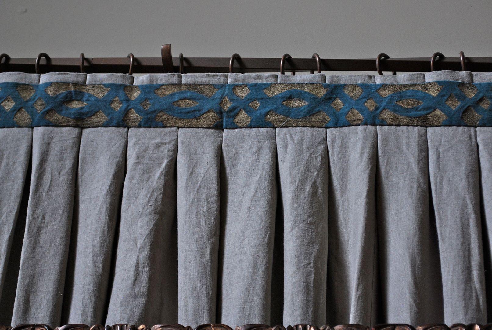
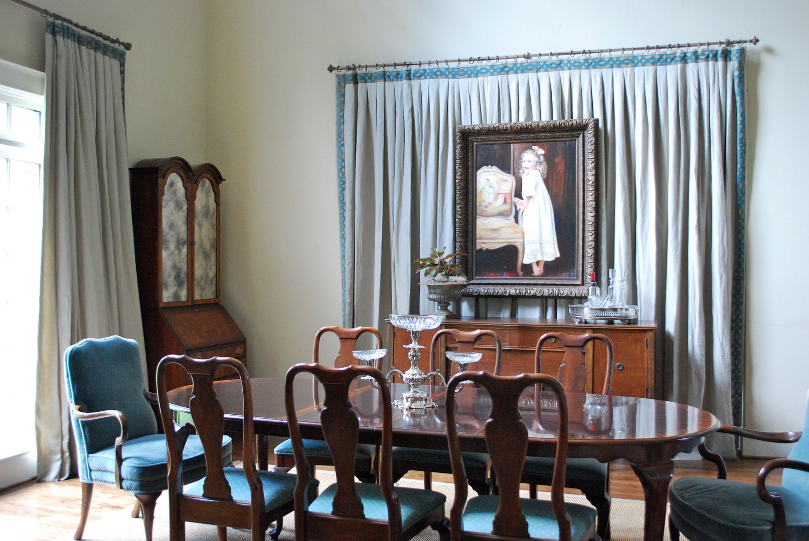
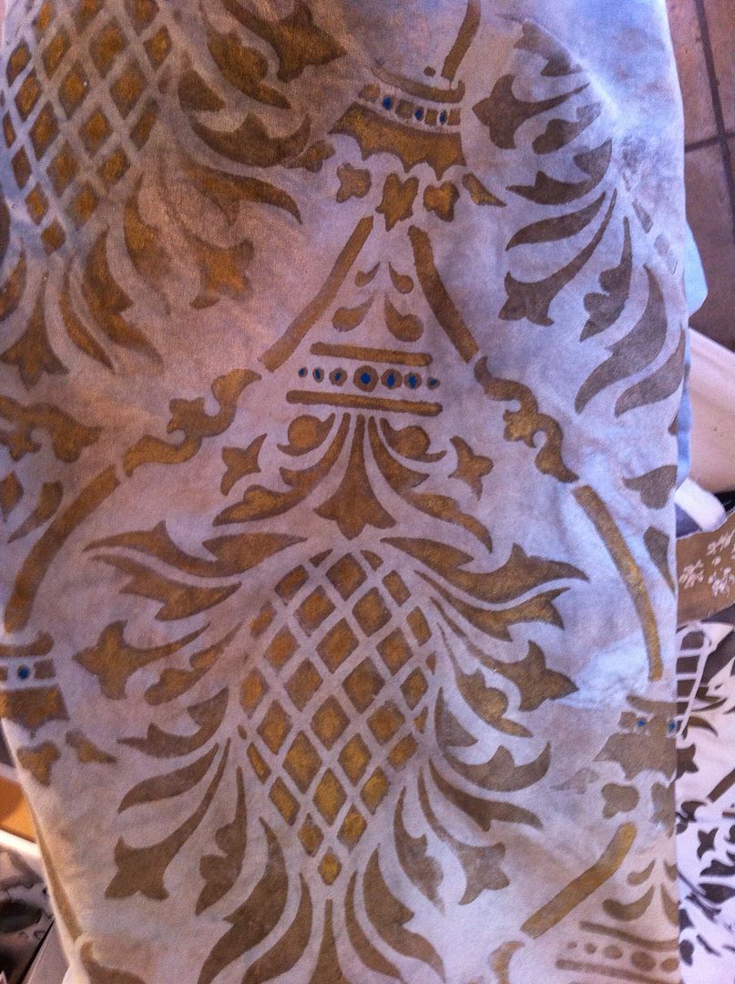
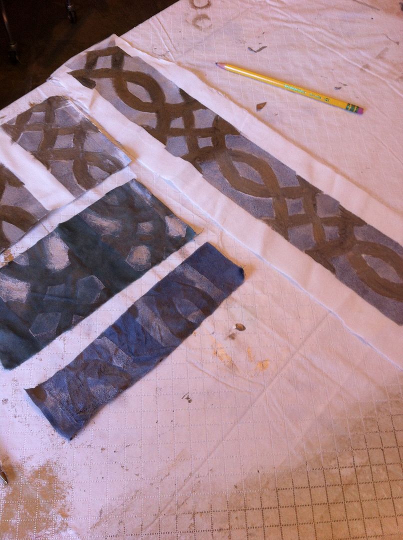
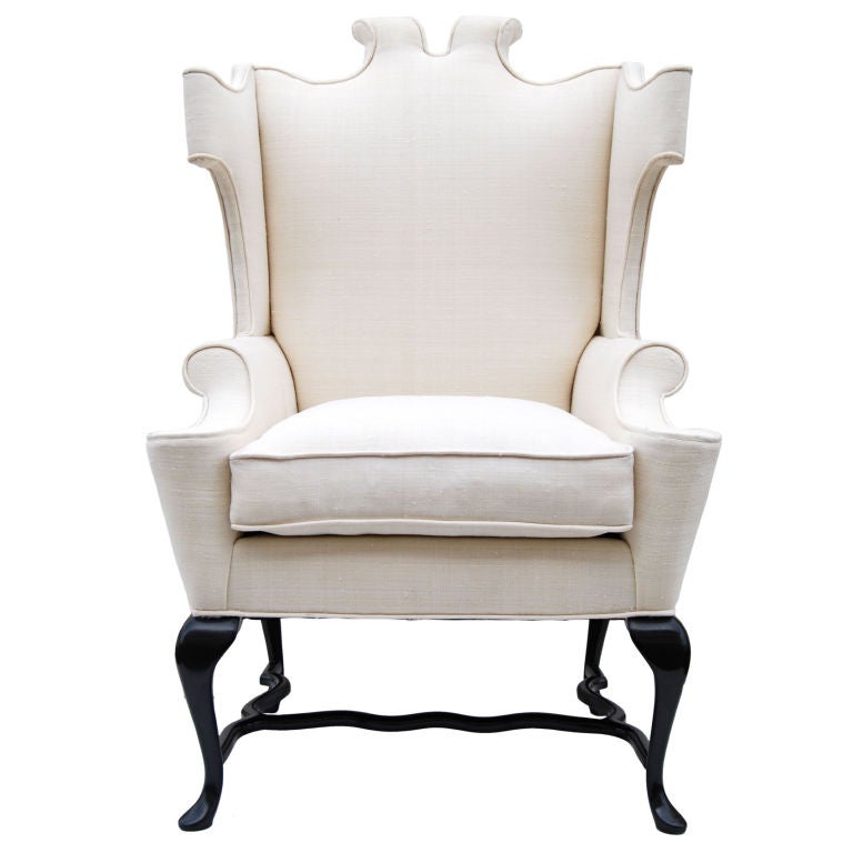
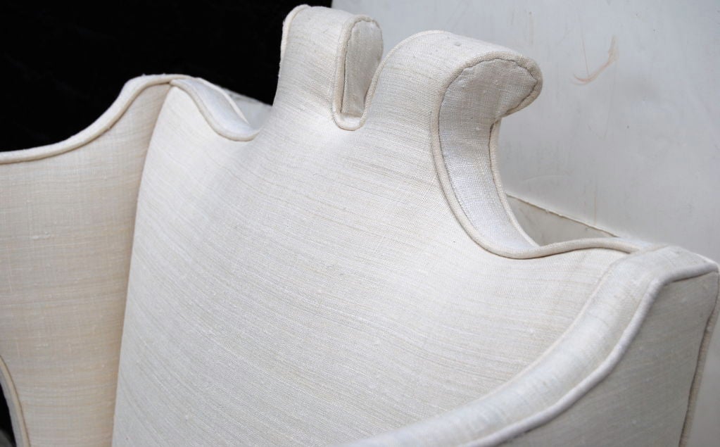
via

Earlier, I mentioned strips of fabric to change the look.  You can take a strip of any Fall fabric, and change the look of a wingback chair (you could even have it monogrammed).   Sort of like this example with the chocolate flannel . . .  (sorry it's blurry, I took it with my iPhone).

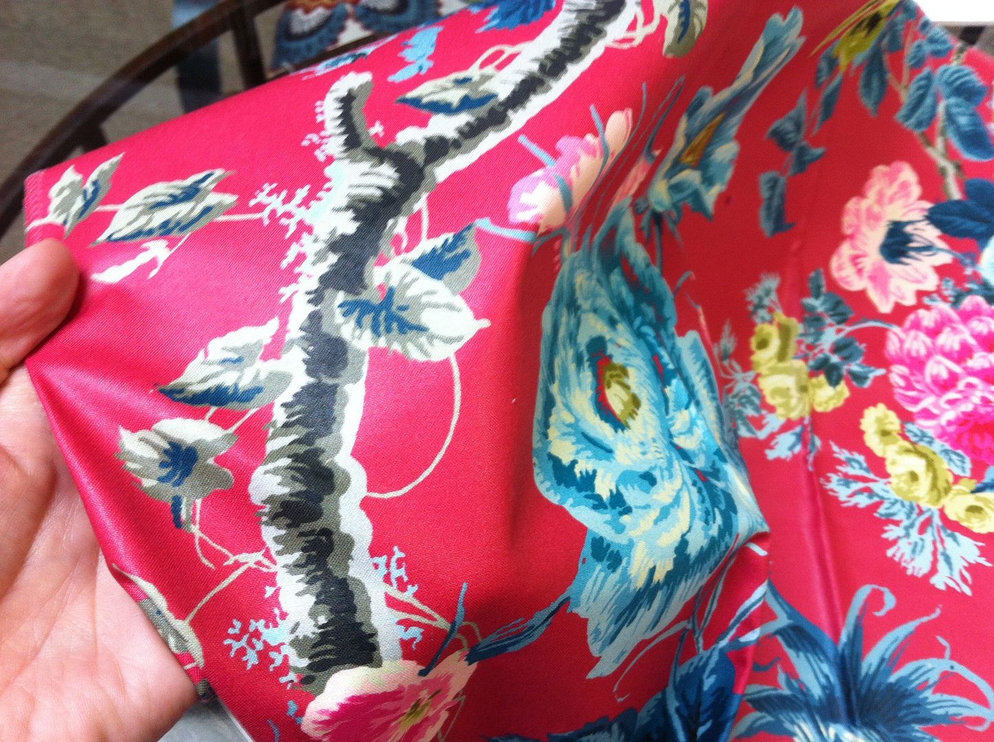
And just because I'm feeling generous, here are a few of my favorite fall fabric finds.  Any of these could be custom made into pillows, slipcovers and even those super cool strips of fabric to be used on sofas, accent and dining chairs for added texture.

Favorite Go To Fall Fabrics
Spice Velvet
via

Blue/Grey Plaid

Embrodered Linen


Camel Houndstooth

GEO Cut Velvet

Enjoy your day, everybody.  M.